Caterpillar
Decatur, Illinois Facility Refresh
The Decatur facility refresh is an long, ongoing project, completing in phases as construction progresses.
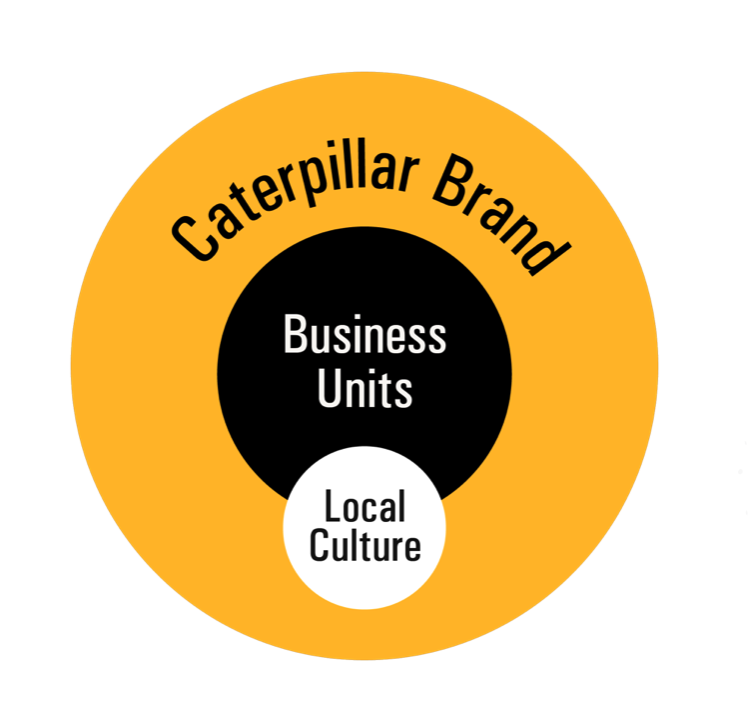
This circle diagram illustrates my strategy for designing large-scale facility environmental graphics.
The intent is always to make the facility look and feel like a Caterpillar facility, with brand colors, typography, and brand graphics.
Next in the visual hierarchy, I highlight the work done in that facility, using either messaging or brand-approved product photography. Lastly, I give a nod to the local culture if the facility is outside the US.
Both the business unit visuals and the local culture are “Caterpillarized” so that everything ladders up to the Brand and looks cohesive.
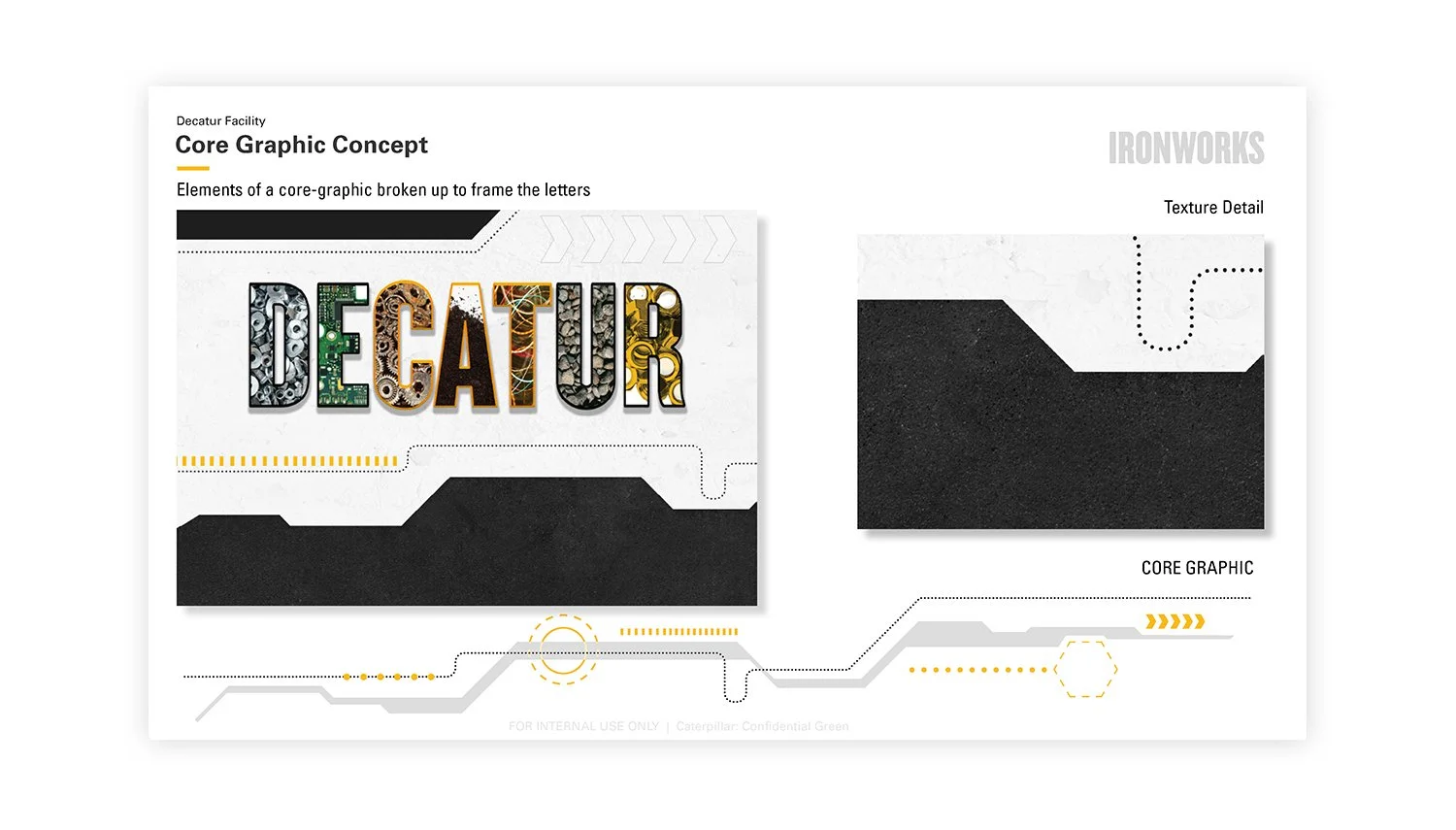
The “Core Graphic”
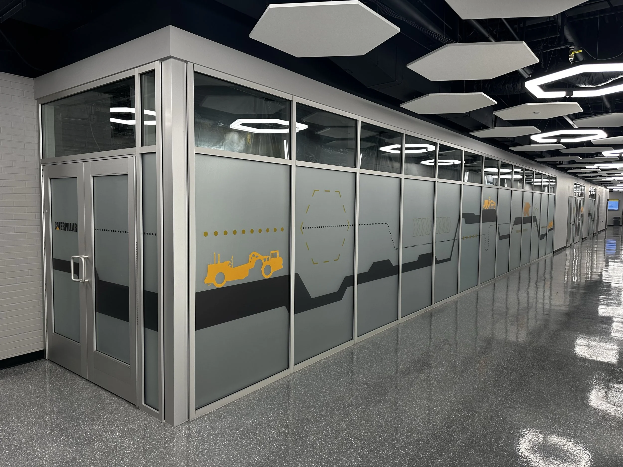
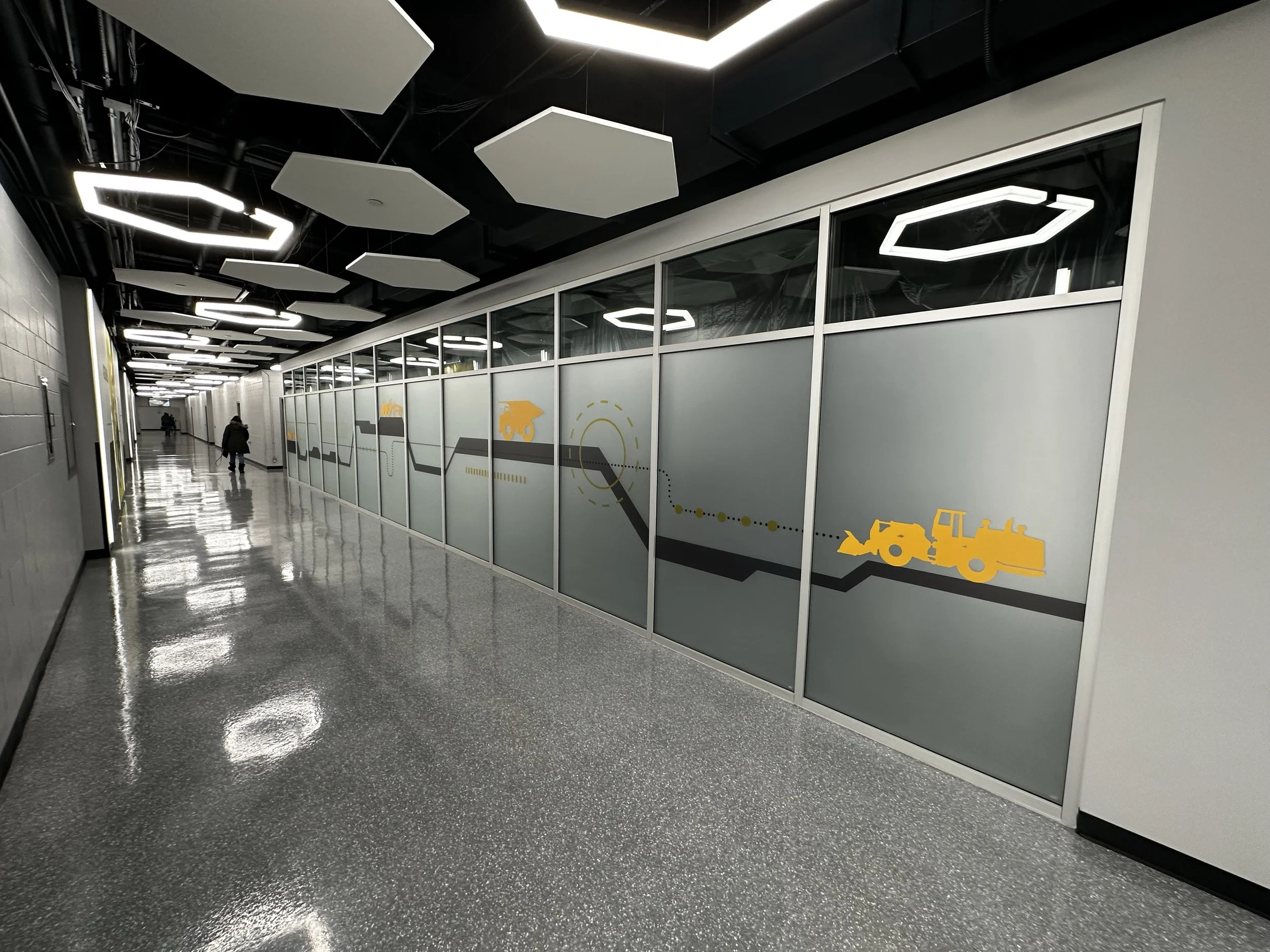
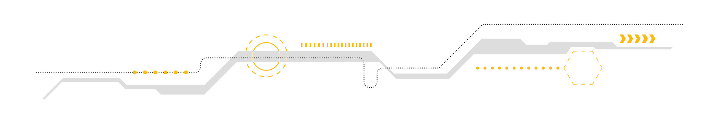
The element that ties each unique facility to one another is the creation of a unique Core Graphic. This graphic is an abstract design that runs along the long corridors of a facility and abstractly references the work done there.
The Decatur facility specializes in producing large, autonomous mining trucks. The core graphic references a mining landscape. Once the core graphic is created, I can pull elements to further abstract it, or use it in full.
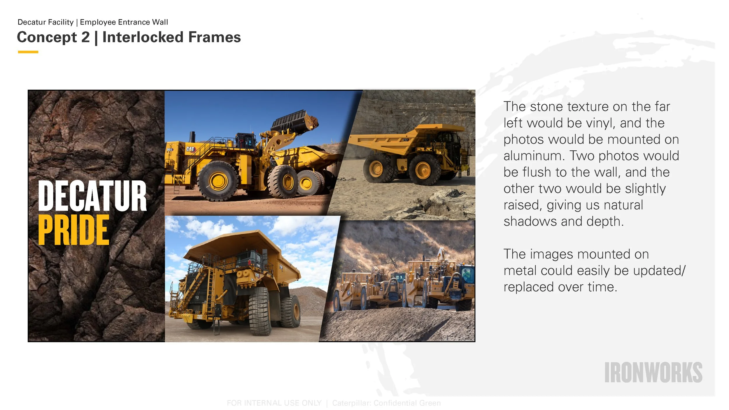
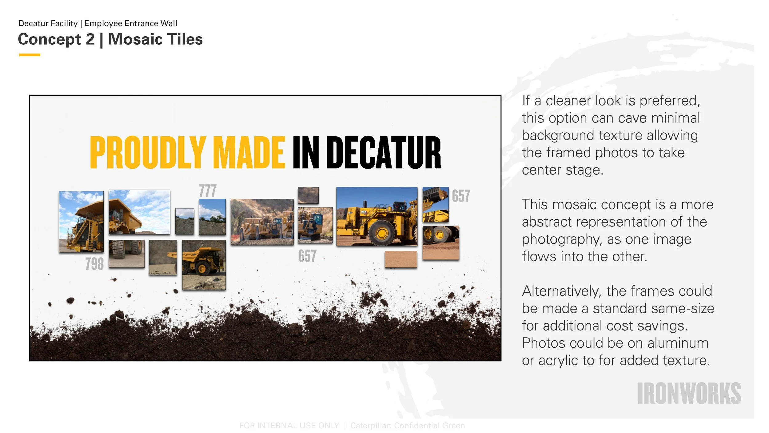
Concepting
Photo Opportunity Wall
Production
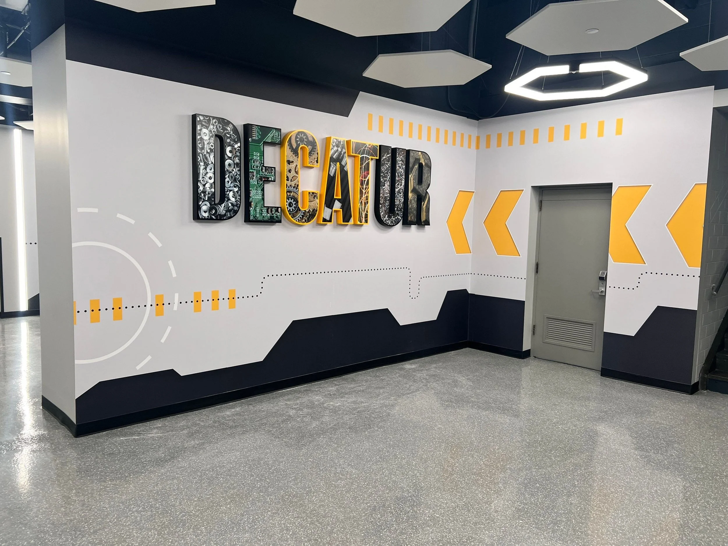
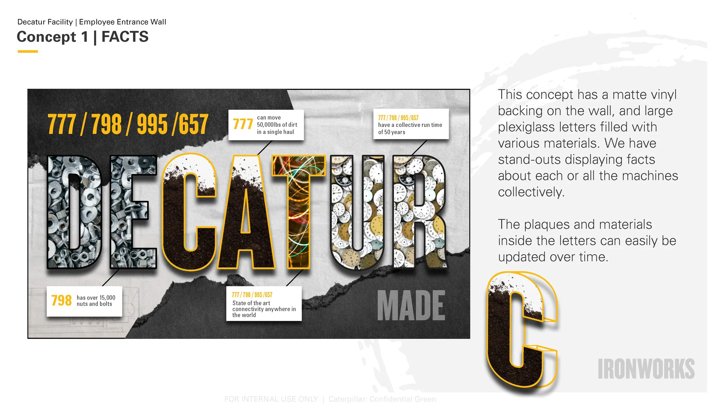
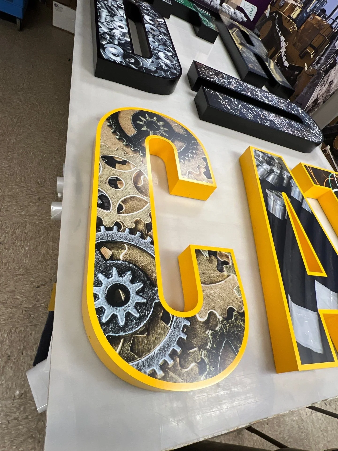
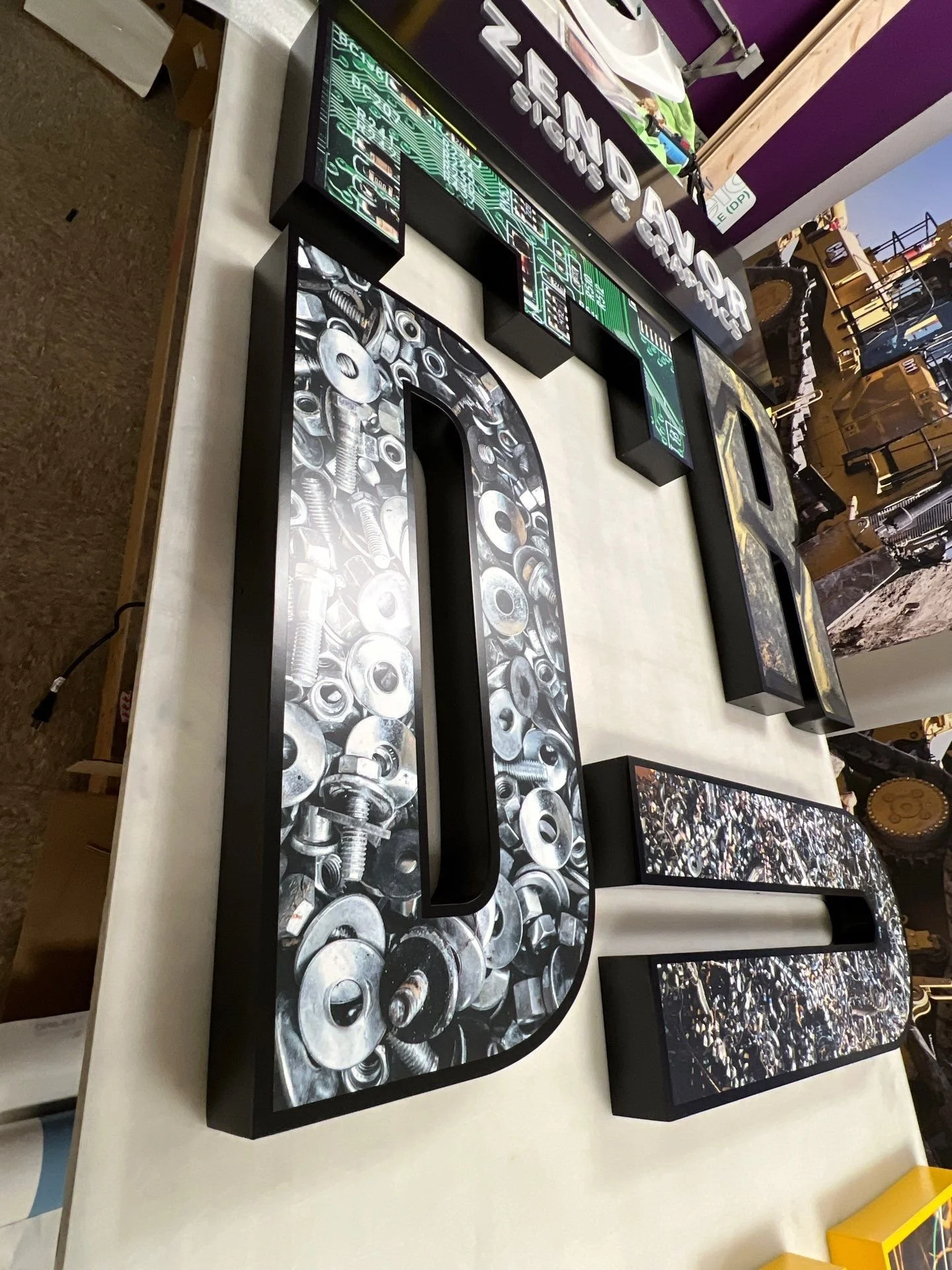
“DECATUR” was constructed as channel letters that stood off a printed core-graphic wallpaper design. The faces of the letters could easily be updated over time by the clients, allowing for an evergreen, cost effective solution. On the faces of the letters, I printed parts and raw machine materials that would resonate with the employees at this facility. I made the “CAT” in the middle of “DECATUR” the Brand Cat Yellow.
Finished Installation